Team signatures
Visualizing the a team's production with a unique signature
While looking at pure numbers is definitely the best way to analyze a team, there's no doubt that an at-a-glance visualization might help provide a quicker means of understanding a team.
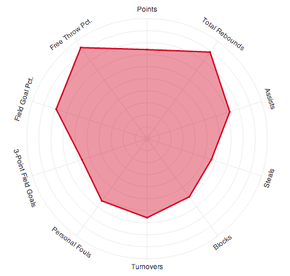
Fast Company had an awesome infographic of player "snowflakes"- basically a radar chart to help compare players at a glance. While radial line charts aren't necessarily great for reading statistics (scales aren't aligned and the domains can be confusing, i.e. turnovers should be flipped), it still does a decent job of presenting the data to uniquely identify a player and is aesthetically pleasing.
After coming across that, and trying to make more use of the random stats I gather, I created the Team Signatures tool that does the same thing, but for teams.
For example, here's the 2014 Chicago Bulls1:
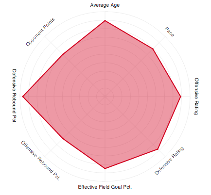
Additionally, I've added some popular advanced stats to get a clearer picture of a team:
I'll be adding some additional features, but feel free to checkout your favorite team!
-
I will, with out a doubt, bias towards Chicago in all future commentary ↩